Lead Generation Page Design
How I designed and tested a recruitment page that successfully hired 4 personnel within 3 days
The problem
A trucking company is in need of drivers for their cargo trucks. They are willing to spend money to run a couple of Facebook Ads for the next months. Although their ads are getting a lot of views, only a few would contact the hiring manager and proceed with the application process.
Scope of work
- User research
- Wireframe design
- *Development
- A/B Testing
*Development using Unbounce
US-based Client
Understanding the target market
Since I don’t have direct access to the target market, I consulted with the client to understand the ideal candidate they wanted to hire. Then I read through online forums to understand their motivations and preferences.
Below is the user persona created from the initial research:
The copy was provided, but the main challenge lies in how to present it to the target audience.
With the copy provided, my task was to streamline it to emphasize the core message.
I then rephrased it to ensure that it will effectively capture and retain the target market’s attention.
The norm for lead pages is to keep all information to a single page.
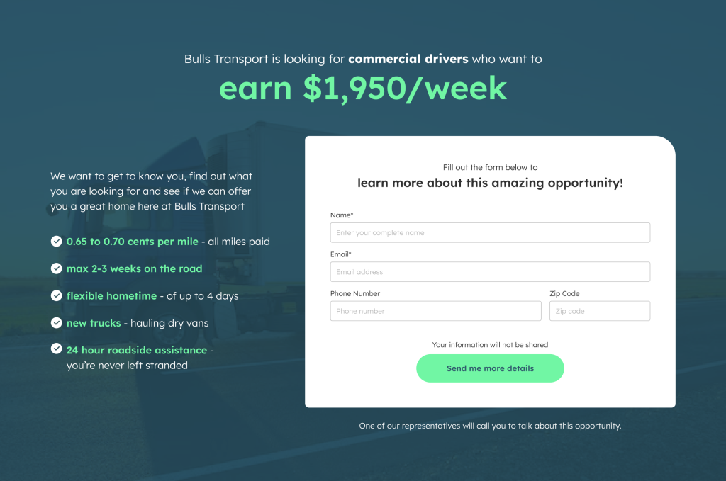
Based on the provided copy, I drafted and developed the initial design of the lead page.
This design is considered as the test case A.
I’m not totally convinced of my own design so I reviewed the user flow and made another adjustment to simplify the process
I laid down the user flow to understand which part of the process would give users the likelihood to drop off. The goal is to minimize dropping off by removing or redesigning these points.
By understanding the process, I made changes to the flow to eliminate redundancy and possible pain points on both the applicant and the hiring team.
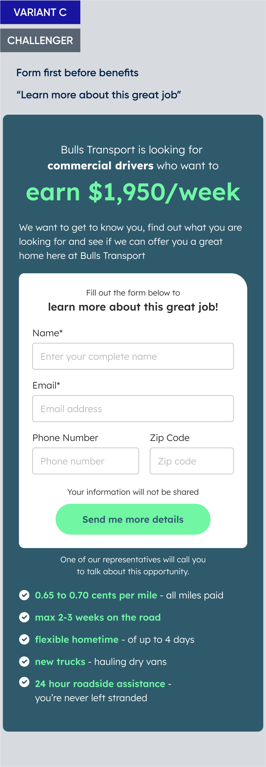
After the review of the process, we redesigned the lead pages
Adjustments to the process resulted to simplified elements. I then redesigned the page with the following solutions in mind:
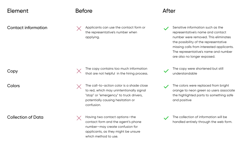
These changes are aimed at increasing the conversion rate of the page.
To further optimize the design, me and the marketing team decided to conduct an A/B testing
Being always on the road, our target users are more keen to use mobile devices. The problem with mobile view is that all the key information are not displayed immediately to the users, meaning they often need to scroll to view the full content of the page.
Our goal is to reduce the drop off rate and increase the number of users that will enter their details into the form.
Hypothesis:
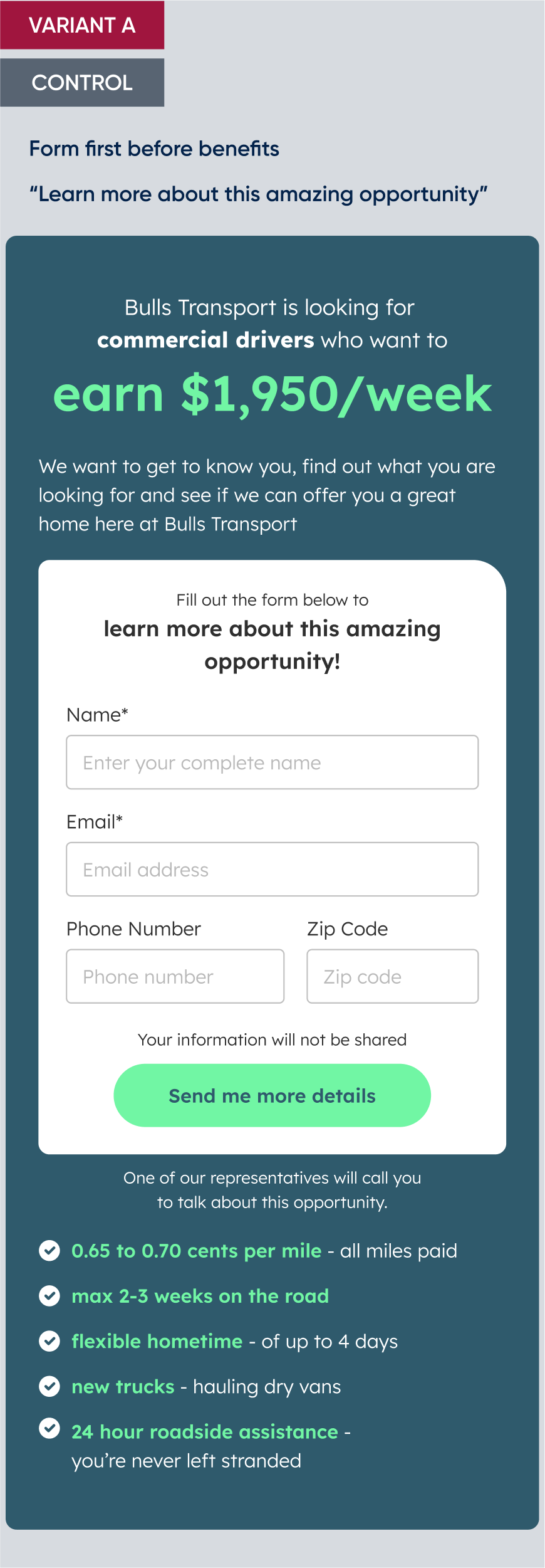
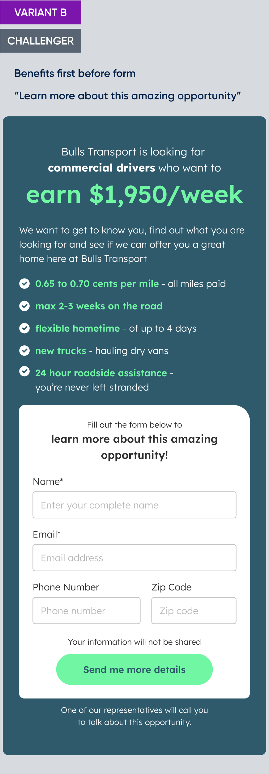
My hypothesis is that changing the order of how the information is presented can increase the registration rate. My suggestion is to present the benefits first so the users will be more motivated to input their information by the time they see the form.
Another colleague is also interested to know the impact of using simple words instead of what he refer to as “marketing fluff”.
With these hypothesis, we created the variants below:
I was tasked to design and develop the wireframes using Unbounce
For this experiment, we chose to use Unbounce to build the landing page. I’ve created the three page variations, and setup the A/B testing.
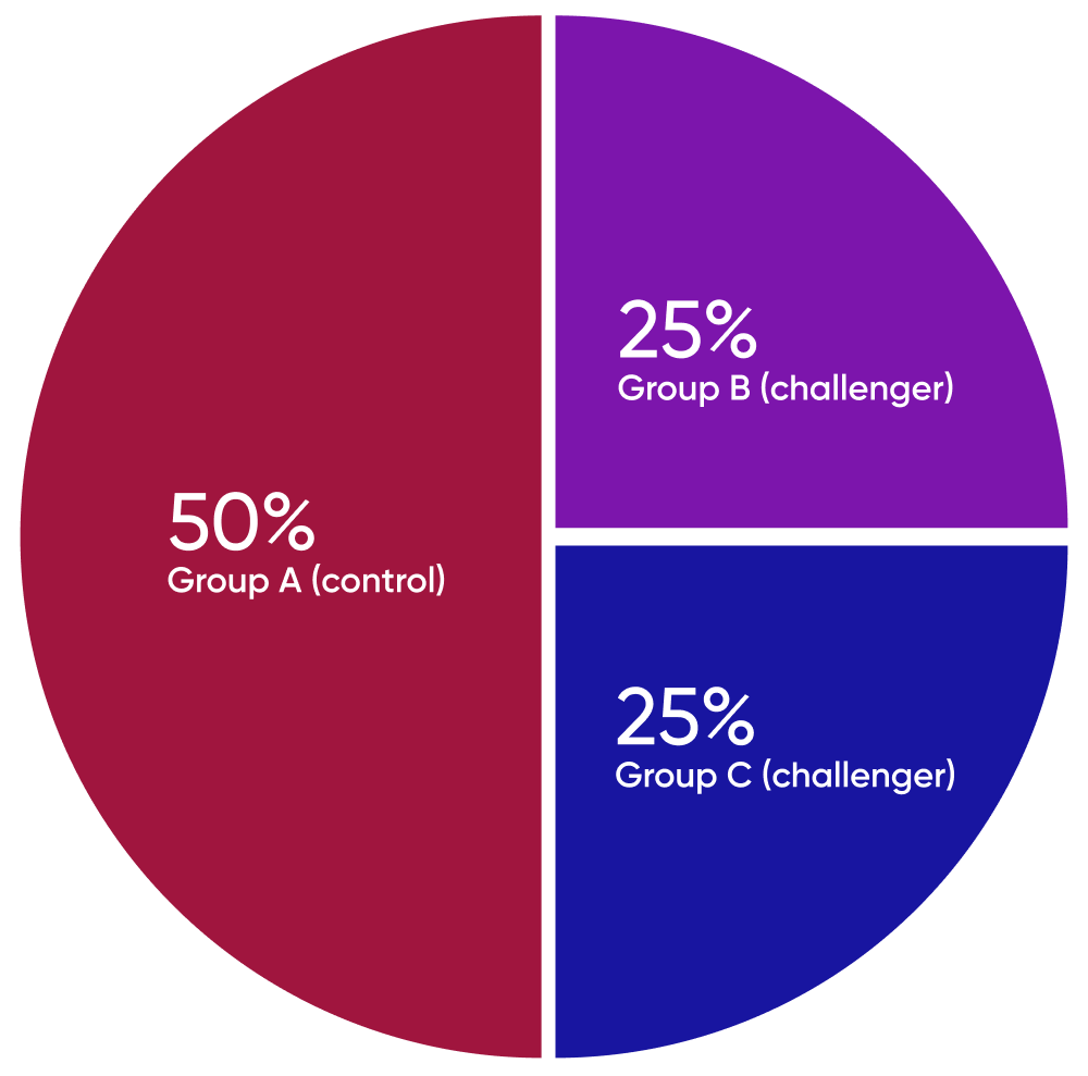
Segmentation:
We divided the audience into three groups using randomized allocation method to ensure unbiased results. The audience is then exposed to the design variations with the following distribution:
- Group A (control) – 50% of the audience is shown the original design
- Group B (challenger 1) – 25% of the audience is shown Variant B
- Group C (challenger2) – 25% of the audience is shown Variant C
We conducted the test by running Facebook ads that redirected users to the landing page
Earlier, we created a separate A/B testing focused on marketing graphics, which we ran through Facebook ads. The winning variant from those ads was selected for use in this experiment.
The ad will serve as a gateway to redirect these users to the landing page where they can input their contact information.
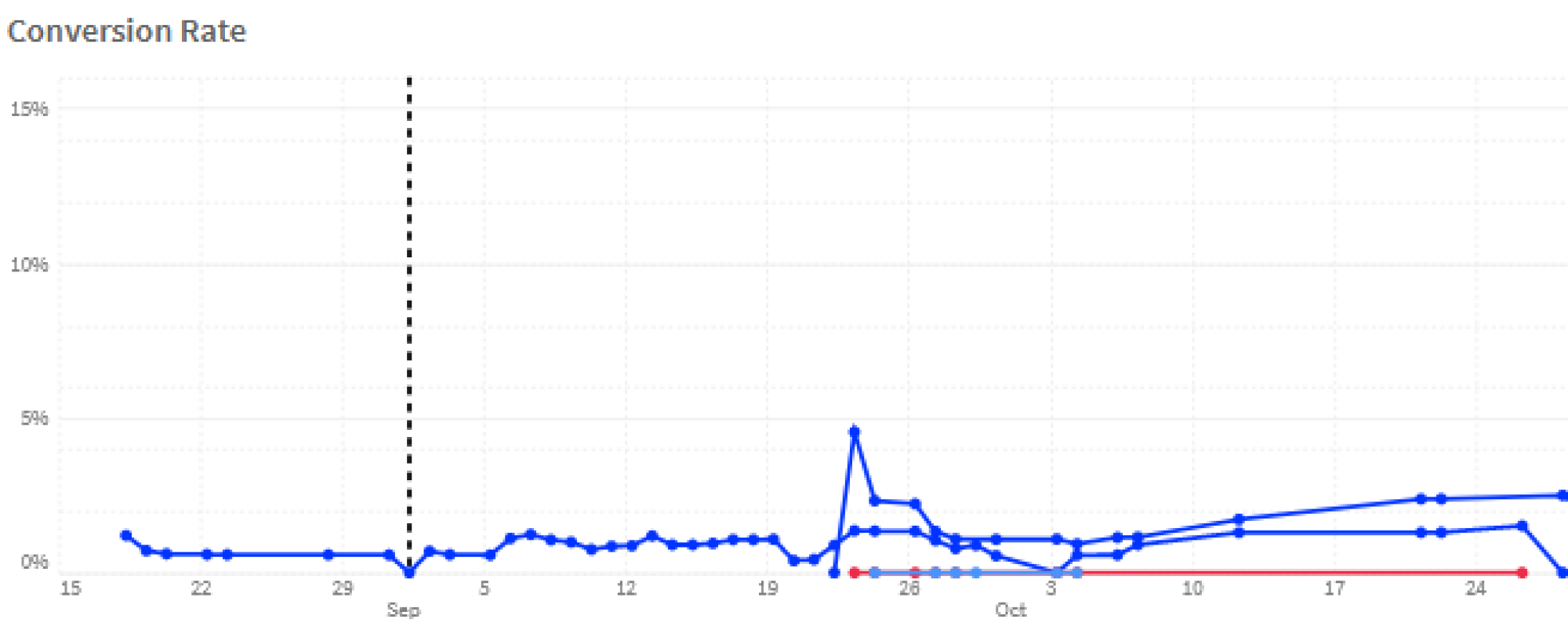
We planned to run this test and analyze the results after a week.
After 3 days of testing, the client requested that we stop the experiment
Between October 24-26, the client received contact information from the users through the landing page. They forwarded this information to their recruitment team for assessment and interview.
3 days after launching the experiment, the client has contacted us saying the vacancies have been filled.
The data are in
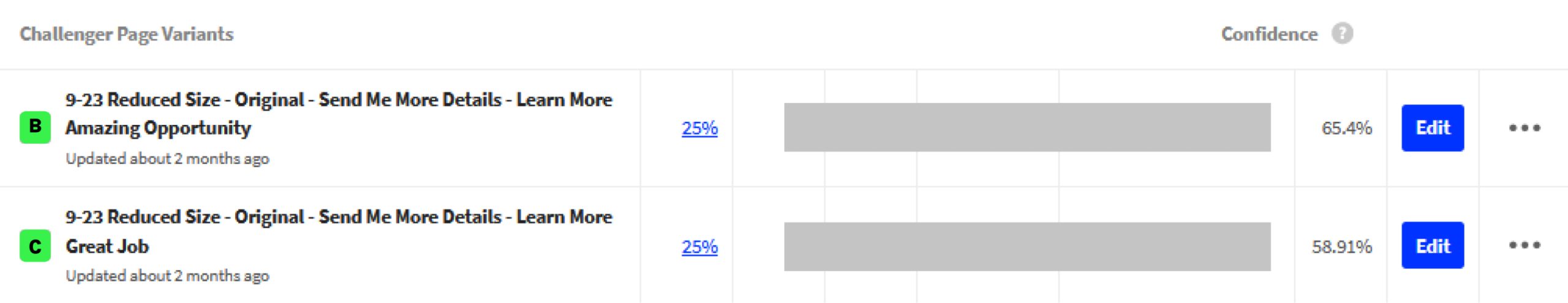
The results were just as I previously guessed: 65% of the people who were shown the benefits before the form ended up filling out the form, compared to only 59% in the other variants.
Additionally, the statement “Learn More About This Amazing Opportunity” performed better than the “Learn More About this Great Job”. Perhaps the wording for the heading do not really matter to these users.
In this test, Variant B is the champion.
The winning landing page led to filling out all 4 vacancies in the client’s job listing within three days
The client was also able to pool more leads for future needs.
Additionally, by discontinuing the ad earlier than expected, the company saved money on the marketing campaigns.
Overall, this A/B testing experiment was both an enjoyable and insightful experience.
There was a slight disappointment of having to end the experiment earlier than planned, but the results exceeded our expectations.
This success not only validated our initial hypotheses but also reinforced my confidence in making informed design decisions based on UI/UX principles.
Moving forward, this experience made me trust in the process of data-driven design, and boosted my confidence in my design decisions.