Lead Generation Page Design
How I designed a landing page that filled 4 jobs in 3 days
The problem
A trucking company needed to hire 4 drivers. They ran Facebook ads and got lots of views, but almost nobody filled out the application. Ads were expensive, but not many people were actually applying.
Scope of work
- User research
- Wireframe design
- Development
- A/B Testing
*Development using Unbounce
US-based Client
Understanding the target market
I talked to the company about what kind of drivers they needed. Then I looked at online forums to see what drivers actually care about.
The Real Challenge: Making the Copy Simple
The company gave me the copy, but it wasn’t working. Fancy words could be scaring people away, and lengthy phrases don’t allow for scanning.
I took the essential parts of the copy to make it short and clear to attract the drivers to apply.
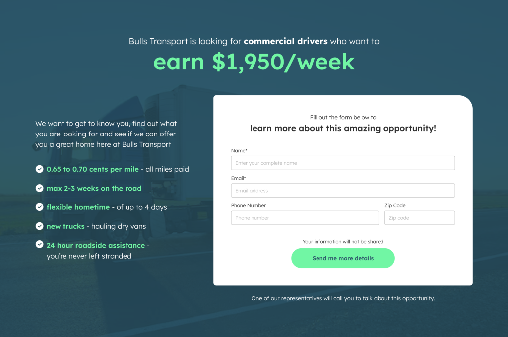
Landing pages work best when everything fits on one page with no scrolling through multiple pages. Hence, I designed the first version below (Version A) using all the copy they gave me.
Userflow Review
I wasn’t happy with my first design, so I mapped out the whole process.
I asked: ‘Which parts in the process have the potential to introduce friction and drop off?‘
I removed the friction and the confusing steps, and made the process shorter. This way, applicants didn’t get stuck, and the hiring team’s job got easier too.
Redesign solutions
Based on the userflow review, here’s what I changed:
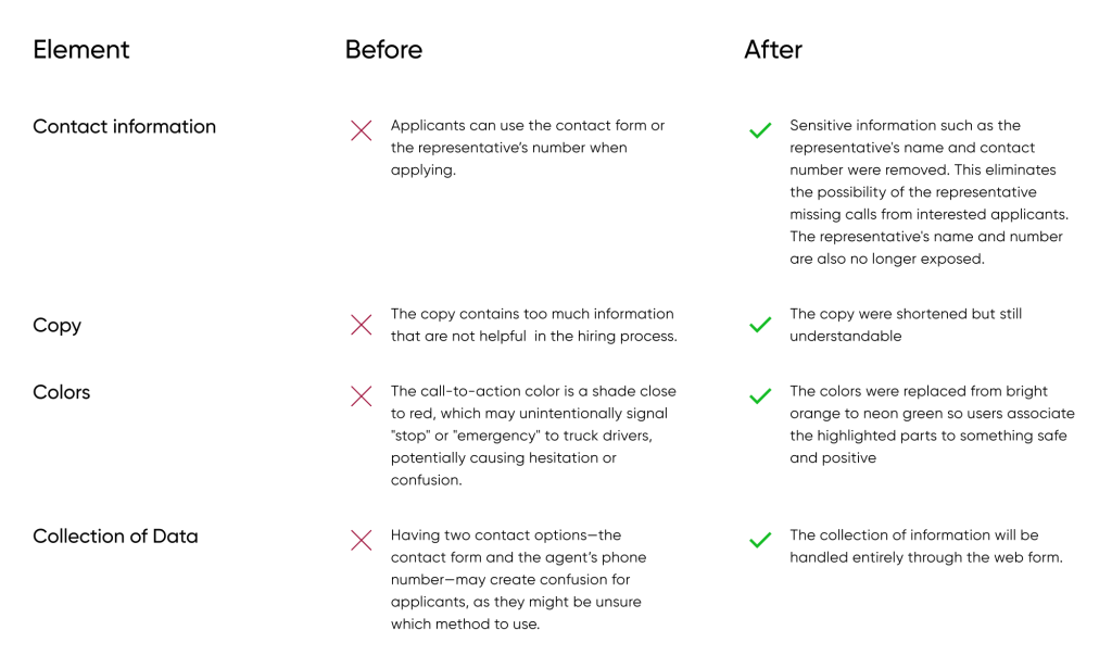
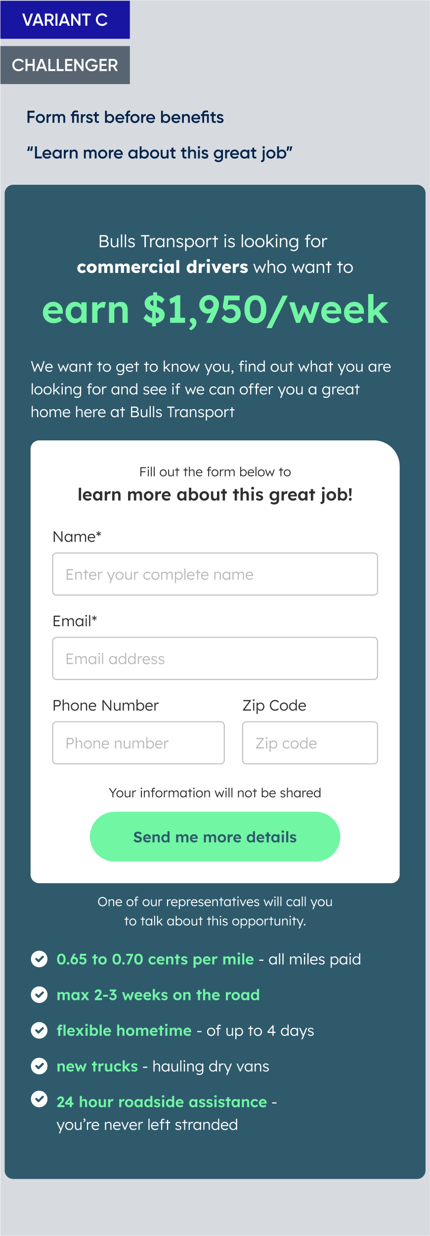
Here’s what the landing page look like after reviewing the userflow:
A/B Testing the Hypothesis
Being always on the road, drivers are more keen to use mobile devices.
On mobile, people have to scroll a lot to see the whole page and many quit before they even see the form.
My hypothesis:
My hypothesis is that changing the order of how the information is presented can increase the registration rate.
If I show the benefits first, people will be excited to apply before they see the form.
My colleague’s hypothesis:
Another colleague is also interested to know the impact of using simple words instead of what he refer to as “marketing fluff”.
His hypothesis is to use plain words instead of fancy marketing language to improve the conversion.
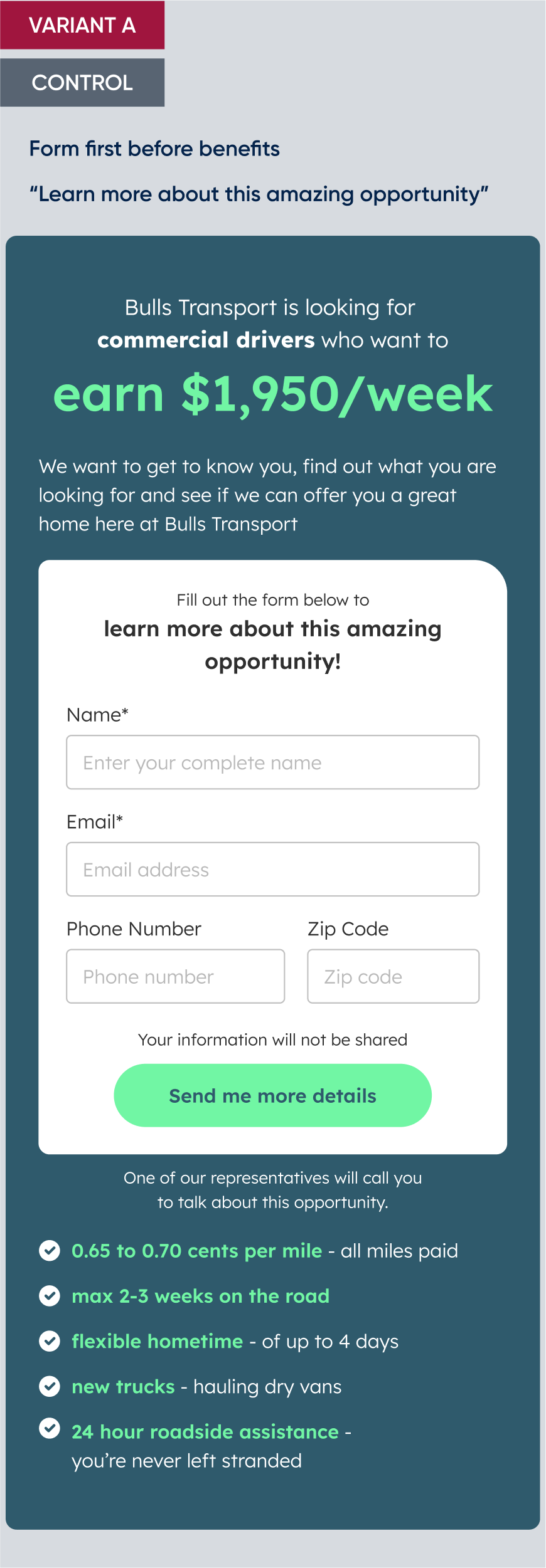
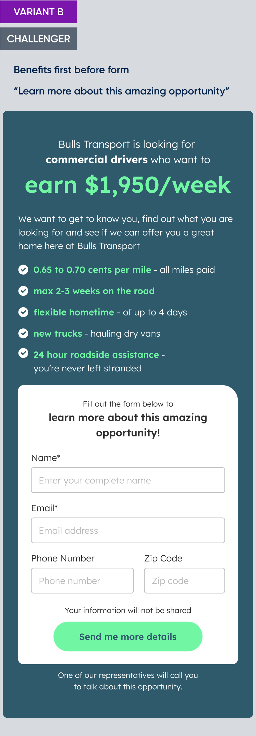
We tested three versions to find out.
A/B Testing Setup
For this experiment, we chose to use Unbounce to build the landing page. I’ve created the three page variations, and setup the A/B testing.
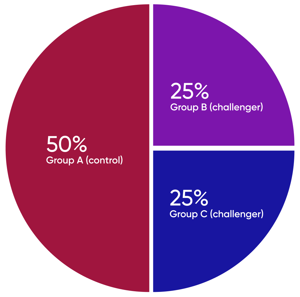
Segmentation:
We divided the audience into three groups using randomized allocation method to ensure unbiased results. The audience is then exposed to the design variations with the following distribution:
- Group A (control) – 50% of the audience is shown the original design
- Group B (challenger 1) – 25% of the audience is shown Variant B
- Group C (challenger2) – 25% of the audience is shown Variant C
We conducted the test by running Facebook ads that redirected users to the landing page
Earlier, we created a separate A/B testing focused on marketing graphics, which we ran through Facebook ads. The winning variant from those ads was selected for use in this experiment.
The ad will serve as a gateway to redirect these users to the landing page where they can input their contact information.
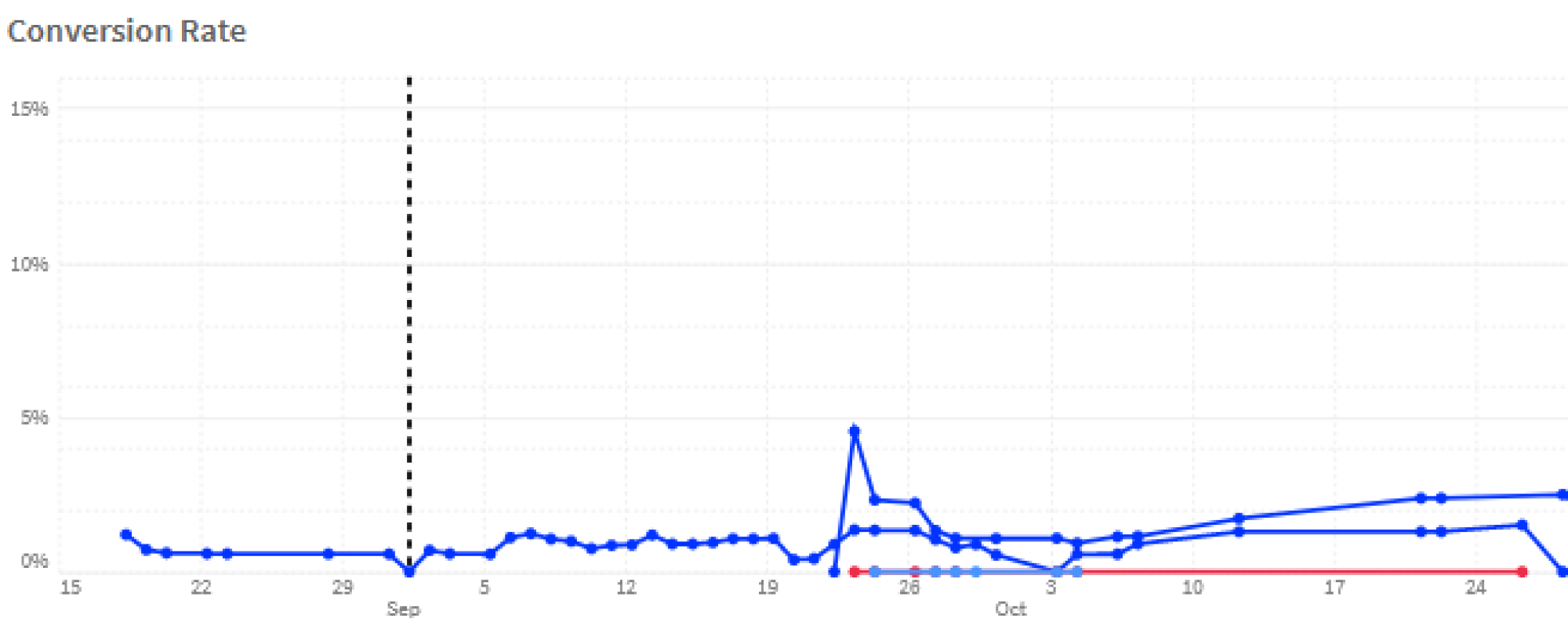
We planned to run this test and analyze the results after a week.
The client requested to halt the campaign
Between October 24-26, the client received a number of application through the landing page.
The client instructed us to finish the campaign on the third day. By then the vacancies have been filled.
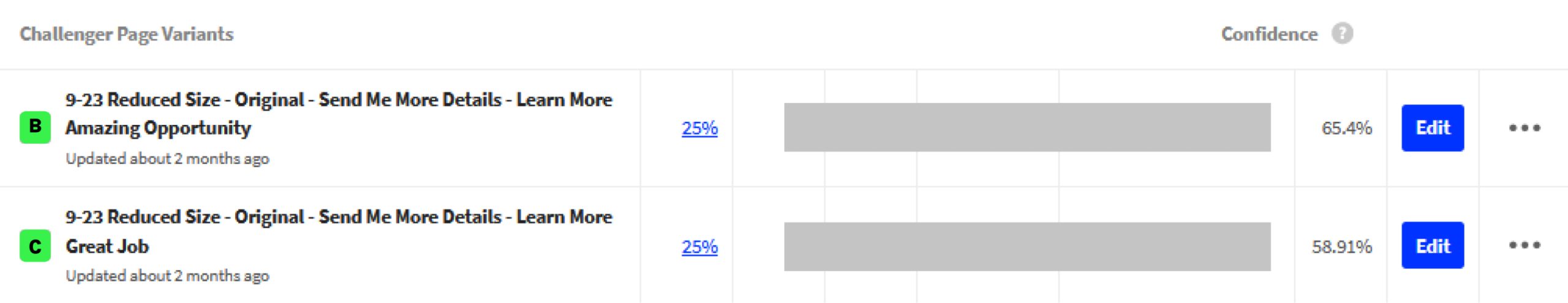
Version B won.
65% of people who saw benefits first filled out the form, compared to 59% for the other versions. That’s a 6% improvement.
Additionally, the exact words used in the button didn’t matter much to the drivers. They just wanted to know if the job was worth their time.
The Campaign resulted to 4 Jobs Filled in 3 Days
The winning landing page did exactly what the company needed.
All 4 driver positions were filled in just 3 days, that’s 57% faster than their target date. They also had a surplus of applications that they can pool as references for future hiring.
And because they filled the jobs so fast, they shut down the Facebook ads early which saved them more money.
The key takeaway in this project is witnessing how the design, through validation of strategic, user-centric approaches, can directly impact the speed of acquiring project goals.
The best part is proving that design decisions should be based on real numbers and not just guesses. When you test with actual users and follow the data, you win.