B2B Product Catalog Website Redesign
Product inquiries doubled after we rebuilt a broken e-commerce experience into a high-trust product catalog
Role:
UI/UX Designer
Industry:
B2B Manufacturing & Supply
Timeline:
2 months
Business Context
The client manufactures and distributes agricultural feed additives and nutrition products to large-scale farmers across Australia, and hosts one of the agricultural industry’s most anticipated annual events. Their brief was to refresh the site and promote the annual event on the homepage.
The real problem turned out to be something else entirely.
Key Outcomes
Doubled product inquiries within weeks of launch
Shifted 90% of post-launch inquiries from event-related to product-related
Accelerated trust through expert credentials, strategic partnerships, and high-impact social proof
Boosted organic visibility by rebuilding site architecture, strengthening internal linking, and targeting high-intent keywords
Research
Formal research wasn’t in scope, but discovery meetings and analytics data showed a consistent behavioral pattern:

Person A
The first signal came from an unexpected source: a colleague with no stake in the agricultural industry who visited the site purely to track events for networking. He’d never once looked at a product page.

Person B
A direct customer of the client confirmed they order products by phone or email and have never used the website to place an order.

Analytics
Data from analytics show that the website would receive an influx of traffic two weeks before and two weeks after the event, with the events page being the second most visited after the homepage, and has the longest retention.
Heuristics Evaluation
I conducted a heuristics evaluation of the different pages of the website:
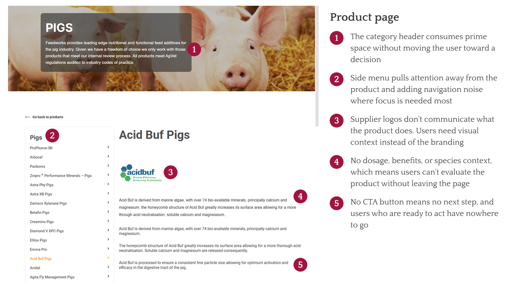
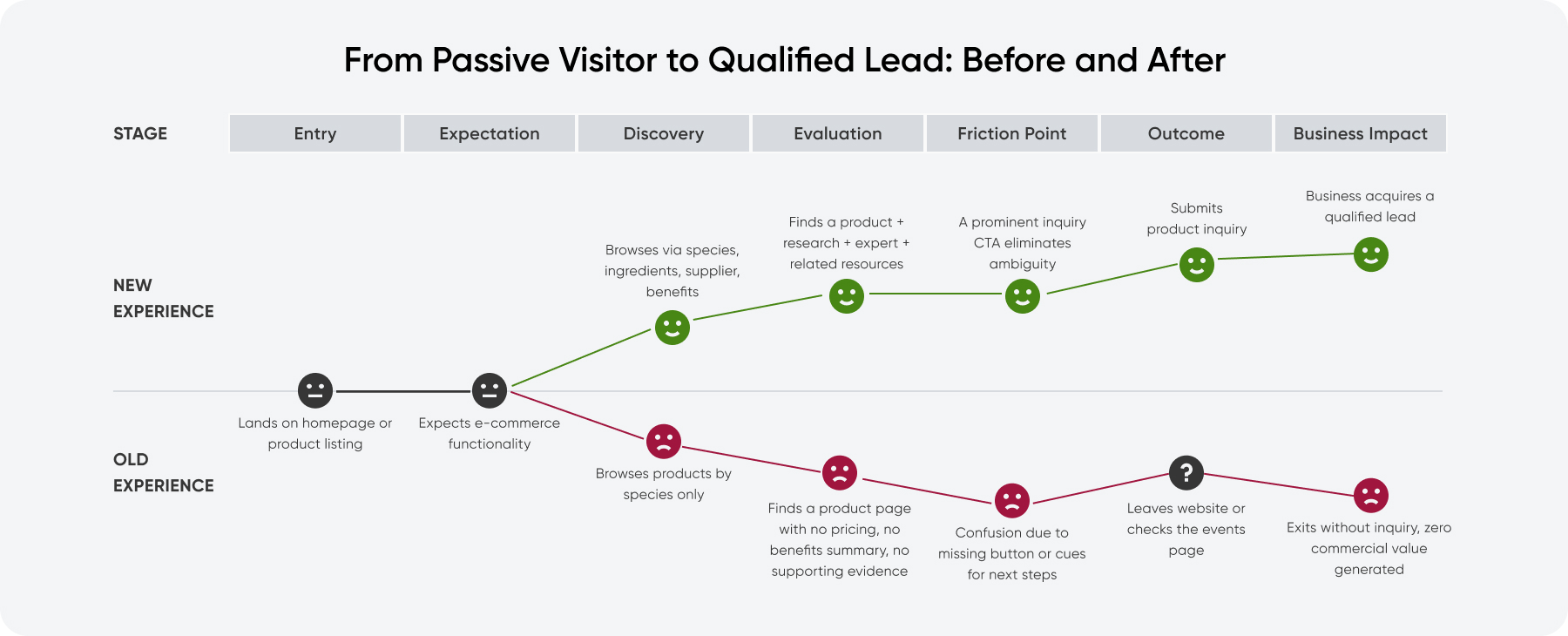
Insight 1
The product pages looked like an e-commerce store but functioned like a glossary. A page with no pricing, CTAs, nor information that supports a purchasing decision. Users arrived expecting to buy and found nowhere to go.
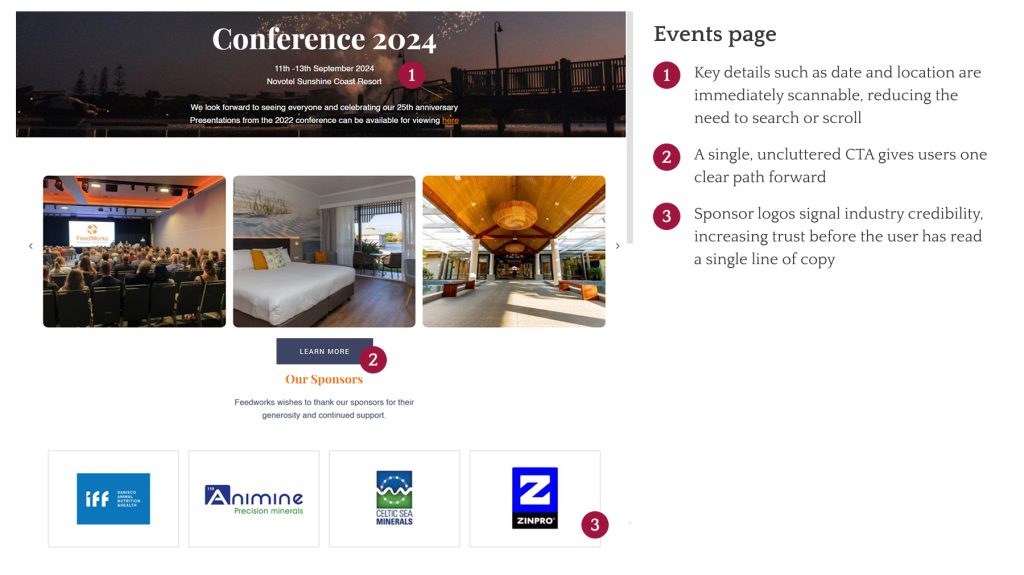
Insight 2
The events page worked precisely because it had what the product pages lacked: clear information, visible CTAs, and social proof. But the event itself happens once a year, and industry participants already know about it through word-of-mouth. Emphasizing it will not benefit the company further.
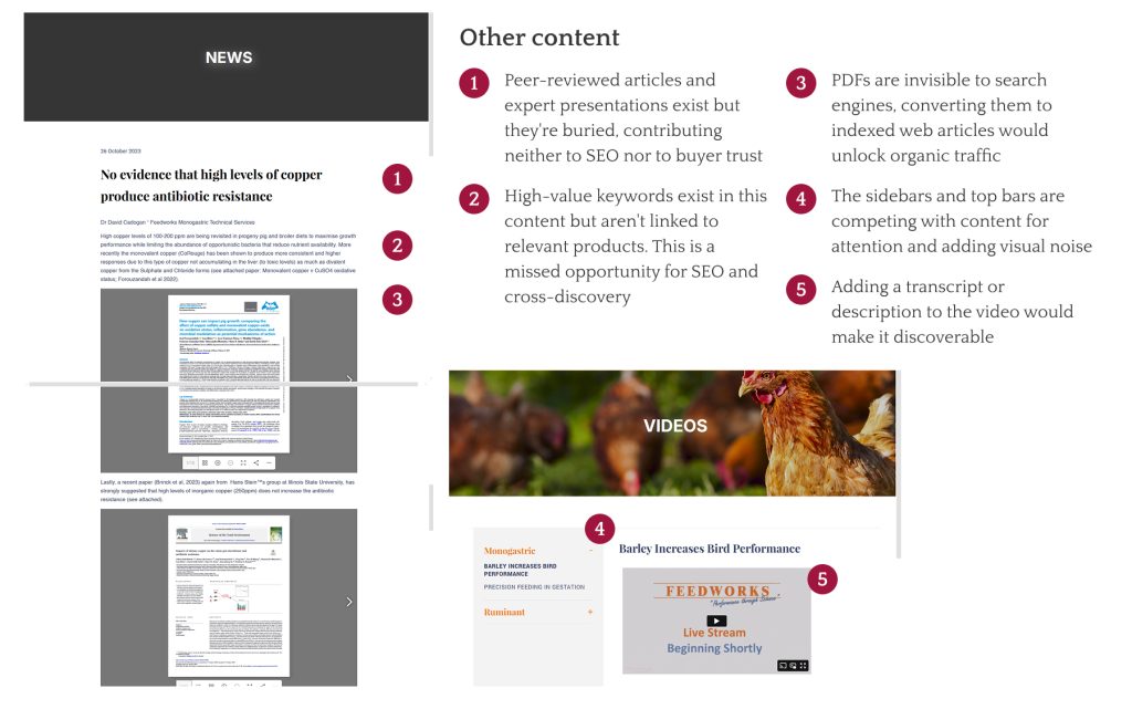
Insight 3
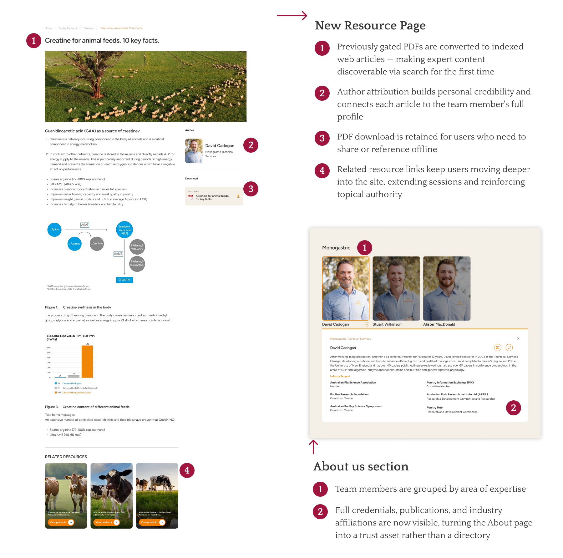
The company had significant content such as peer-reviewed publications, expert credentials, industry association involvement, but these assets were either gated behind membership or buried in low-traffic corners of the site. They weren’t contributing to trust, discoverability, or conversion.
Reframing the brief
Two issues emerged from the research data.
First, the client misinterpreted the traffic pattern. High traffic to the event page means that it’s the only useful page on the website. Fixing the product pages would convert existing visitors who were already arriving with commercial intent.
Second, the site held scholarly articles and expert content that were buried and unlinked, doing nothing for search visibility or credibility. Surfacing and connecting that content would build authority and bring in new users organically.
The original brief asked for more event promotion but the research is leading the project to a different direction.
Stakeholder decision pivoted:
First, the client clarified that the pricing is deal-based/quote-based and never published publicly, which ruled out a standard e-commerce model. This is a key constraint.
Second, they agreed to remove the membership area entirely and make previously gated event presentations publicly accessible, repurposing them as on-site resources to build organic authority and drive product discovery.
The brief was now inverted. Instead of promoting the event on the homepage, the goal became making the product catalog as credible, navigable, and conversion-oriented as possible.
Strategy & Key Design Decisions
The strategy operated on two parallel tracks:
Discoverability
Surface hidden content to build topical authority, strengthen internal linking between resources and products, and expand navigation beyond species-only browsing.
Conversion
Rebuild product pages as decision-support surfaces with clear CTAs, scannable information, and an inquiry flow that mirrors familiar e-commerce patterns without requiring public pricing
This journey map shows where the old experience broke down and what the redesign was specifically built to fix at each stage
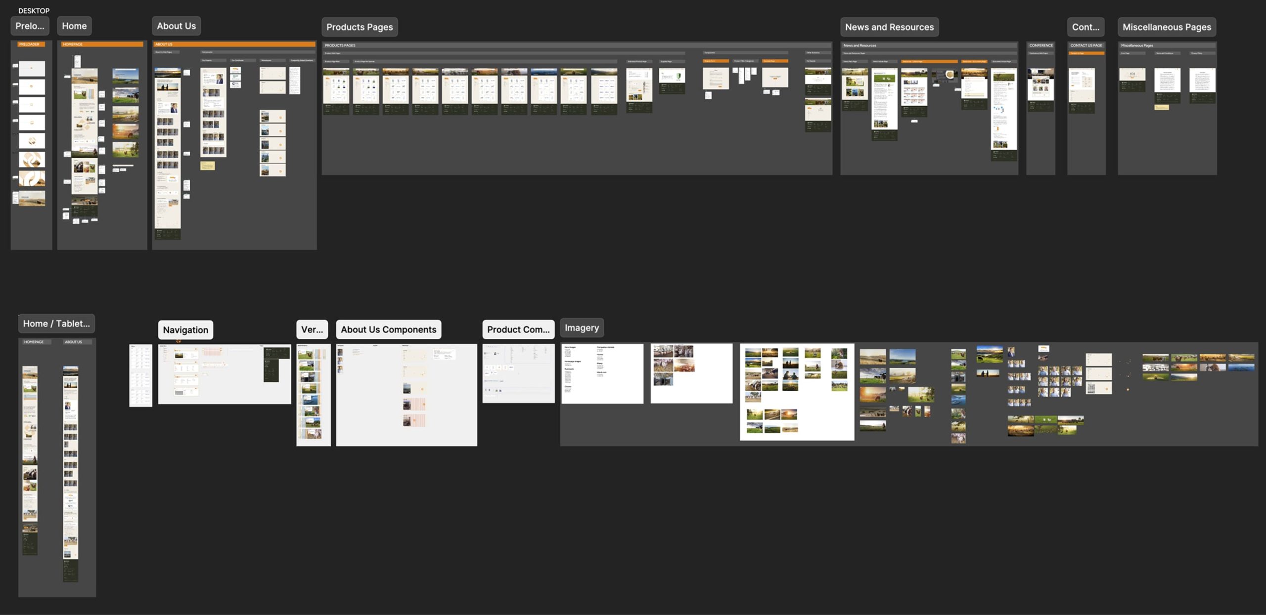
High Fidelity UI
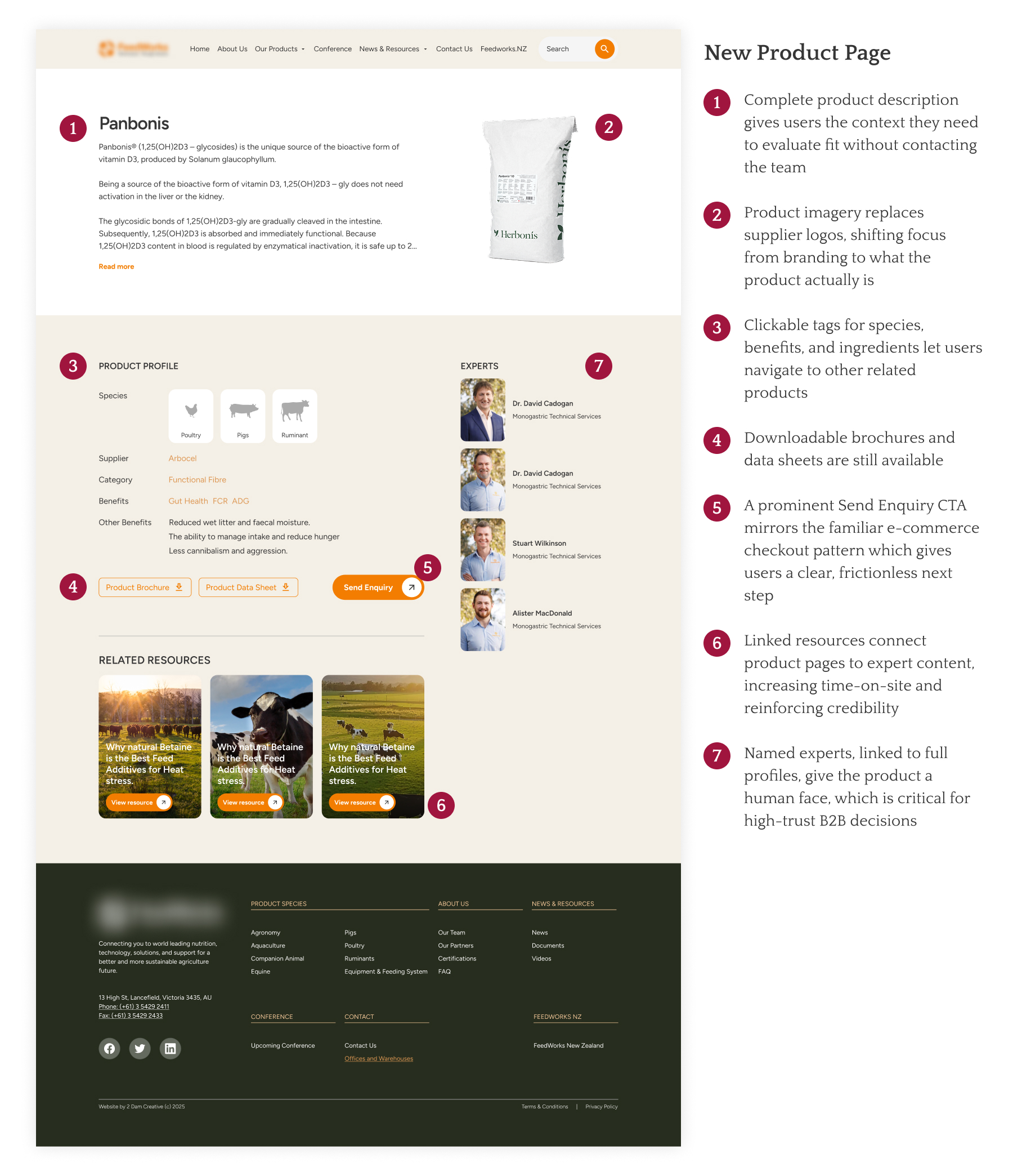
Product Page as a Decision Hub
Each product page was redesigned to function as a sales-enablement surface, featuring:
- Clear product context
- Related research and technical resources
- Associated experts and team members
- Presence of a clear inquiry CTA
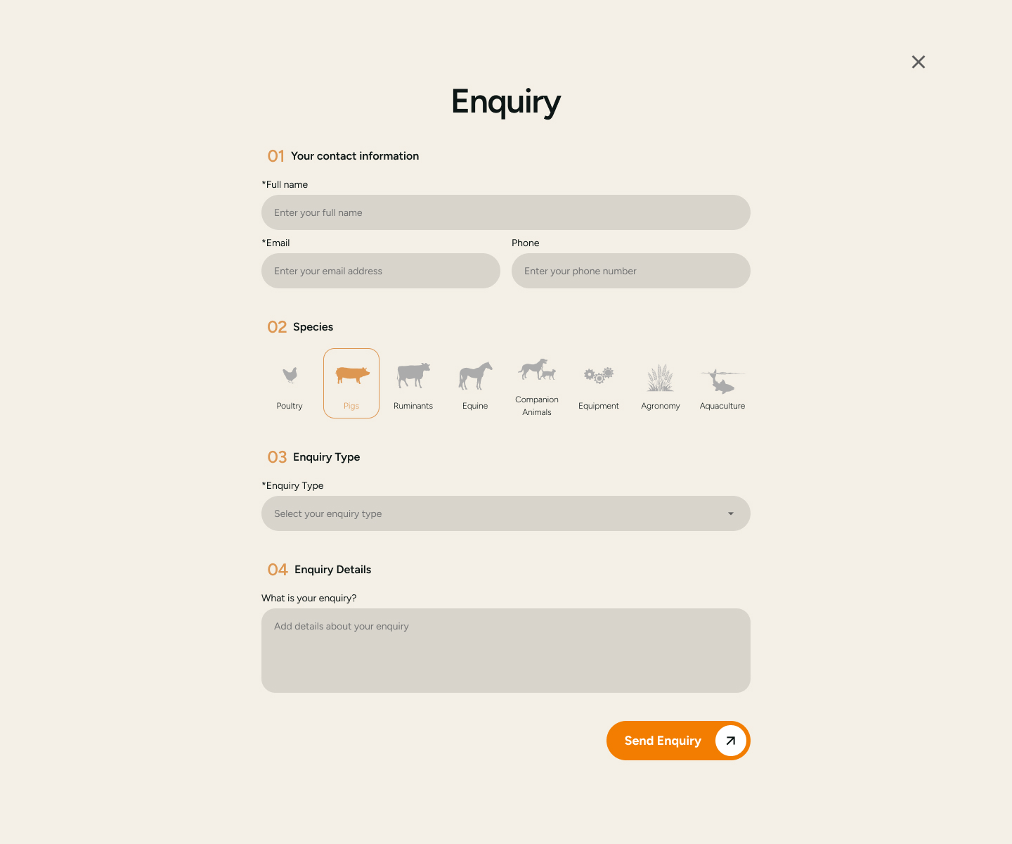
Inquiry Form to Funnel Leads
I added a prominent CTA on product pages that routes users to an inquiry form in place of checkout. This mirrors a familiar e-commerce flow with clear next step and reduced friction, while aligning with the client’s consultative sales model and capturing qualified leads.
Authority signals were strategically placed all over the website
The home page and other inner pages contained partner logos, expert credentials, and other authority signals. Some presentation materials that were behind membership were made public and strategically linked them to relevant products to improve SEO, discovery, and product intent.
Collaboration
Key partners in this project are:
- Product Manager
- Content Team
- Client Stakeholder
- Developers
I worked closely with the product manager (who served as the bridge to stakeholders) to surface a critical misalignment: the client had drawn the wrong conclusion from their own data, assuming users preferred events over products. Uncovering this early, shaped the entire design strategy.
Engineers were brought in before designs were finalized to flag technical constraints early and keep development lean. At handoff, the Figma file was fully annotated with contextual notes so the team could build without ambiguity or back-and-forth.
Results & Validations
Conversion impact
Post-launch, the client reported a 2× increase in total inquiries, with approximately 90% of inquiries shifting to product-related inquiries, indicating improved commercial intent and clearer conversion pathways.
Organic visibility & discoverability
Client emerged as the top organic competitor in its niche, ranking for 102 industry-relevant keywords, significantly more than direct competitors.
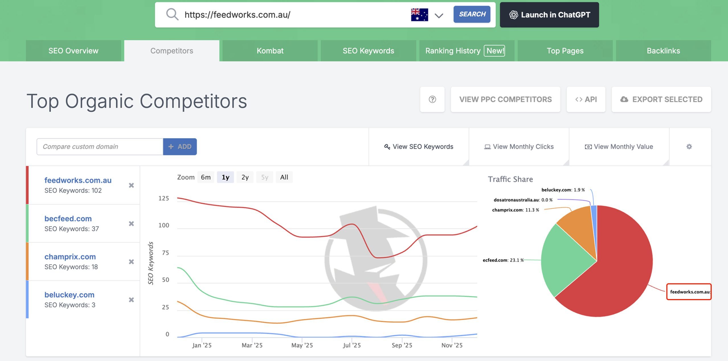
Newly ranked keywords clustered around ingredients, suppliers, and functional concepts (e.g., rumen, supplier brands), confirming demand beyond species-based navigation.
These keywords moved from 100+ positions to page 2–3, indicating growing topical authority and improved crawlability.
Reflection
Instead of treating the redesign as a visual polish exercise, I used UX as a diagnostic tool, which resulted to findings that challenged the assumptions of the client.
The most important decision in this project wasn’t a design decision but the choice to challenge the brief. The client came in with a diagnosis. The research suggested a different one. Presenting that reframe, and getting the client to invert their own brief, required more stakeholder management than any wireframe.
The design trade off in the pricing of products was tricky considering it can be a bottleneck to conversion. In this challenge, I learned about balancing the user needs with the unique business process. Since pricing is deal-based, I didn’t force an e-commerce checkout. Instead, I designed an inquiry flow that feels familiar and easy for users, while still supporting the client’s consultative/quote-based sales process.
Finally, in B2B, trust comes before conversion. This project was a case study in building that trust systematically through content, credibility, and clarity, rather than assuming it exists.